


 Tweet
Tweet
This going to take some getting used to....I hate when websites change their layout and design! Facebook, hotmail, etc. etc.
-
-
yeah this trash. ill be back when its not trash
y'all be good.
WAR YILDIRIMComment
-
This site now forces you to sign in Everytime you visit?Comment
-
I tried the dark mode, boring. This is the better of the two evils. The red can change to green or blue. BoxingScene tried blue and white themes before. The red vibes violence. Maybe the nature of the business.Comment
-
Maybe this is the rushed version for us? We are appreciative.Comment
-
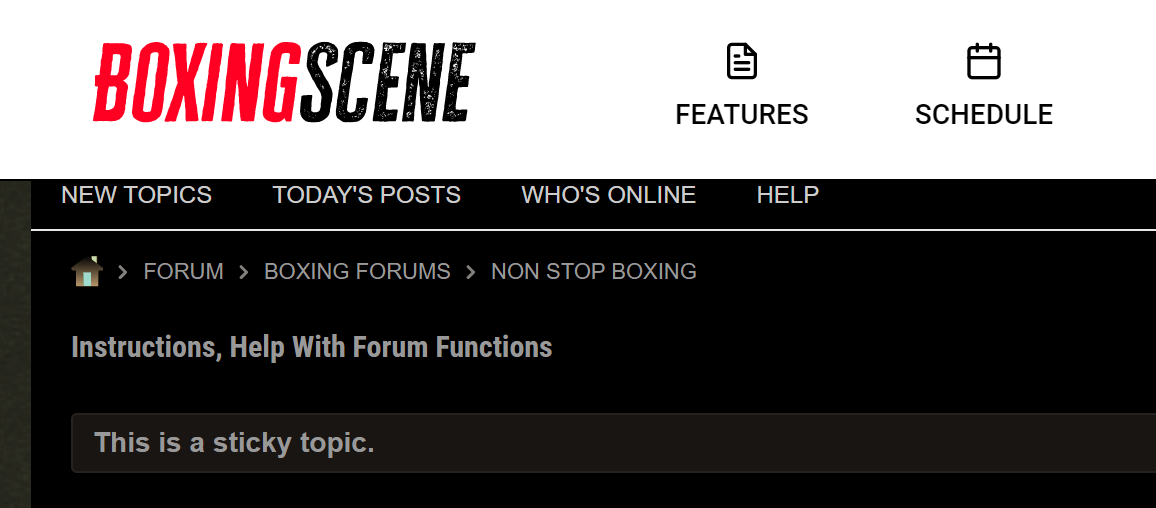
ok, so someone talked about "Messages". Which I didn't see. Now I know why. It's because the header bar is too large and literally covers it.
Here's a screenshot:
I removed the ad white space and scrolled down, and see this:
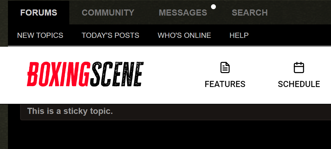
Now, I imagine whoever envisioned that top bar didn't actually test this to understand from a UI perspective that it would hide three critical functions (link to Forum, link to Search, link to Messages).
And I question why that bar cannot just be a sidebar, given all of the empty space on the left and the right.Comment


Comment