
 Tweet
Tweet
-
-
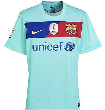
You think that's ugly? You should see Barca's new away kit. -
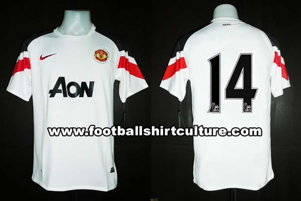
looks kinda early 90's retro.Comment
-
-
-
Looks kinda retro to me.Comment
-
-
If the idea is to make players look like commercial aircraft then they were successful. This is far from the ugliest man united shirt in the history of the club though.Originally posted by Chicharito View Post
This one with the laces was pretty awful
This one was an atrocity too

But the funniest is this one:

This one sparked the now infamous strip-change-at-half-time incident, because they blamed the grey strip for making each other invisible!
http://www.independent.co.uk/news/un...y-1305058.htmlComment
-
I had the grey one! *hangs head in shame*Originally posted by squealpiggy View Post
On a serious note, the new one only looks so bad because of that crappy 'Aon' sign or whatever...Comment
-


Comment